
Audit Your Brand Assets: 5 Signs Your Visuals are Devaluing Your Price Point

Imagine you are walking down a busy street in Auckland or Sydney. You see two coffee shops side-by-side. One has a hand-drawn sign on cardboard with mismatched chairs. The other has a sleek, gold-foiled logo, beautiful wooden textures, and a menu that looks like a piece of art. Even before you taste the coffee, you have already decided which one costs more. You have already decided which one is better.
This is the power of visual perception. If your business is providing a premium service but your logo looks like it cost fifty dollars from a DIY website, you are fighting an uphill battle. You are essentially wearing a tracksuit to a black-tie wedding and wondering why no one is asking you to lead the toast. At Wild Sea Creative, we see this often. Brilliant business owners in New Zealand and Australia are being out-priced by competitors who aren't necessarily better at the job—they just look better on screen.
Doing a Brand Asset Audit is the first step to fixing this. If you want to charge what you are actually worth, your visuals must speak the same language as your price tag.
Key Takeaways
Trust is Visual: High-quality visuals create immediate trust and justify higher price points.
Consistency Wins: Using the same style across all platforms removes brand friction and builds authority.
Filter Your Leads: Professional branding scares away bargain hunters and attracts high-value clients.
Modernise to Compete: If you look dated, your competitors will out-price you simply by looking more current.
Confidence is Profit: When you love your brand, you sell your services with more conviction.
1. Your Logo Feels Budget While Your Price is Premium
The logo is often the first thing a potential client sees. It is your digital handshake. If that handshake feels weak or dated, the trust is broken before the conversation even begins. A cheap logo often uses clipart styles or fonts that everyone else is using. It lacks a unique Visual Identity Strategy.
When a customer sees a generic logo, their brain instinctively categorises your business as low cost. If you then send them a proposal for a high-end service, they feel a sense of cognitive dissonance. It doesn't add up. They start looking for reasons to haggle on price because your brand hasn't earned the premium status in their mind. Your competitors are winning because they invested in a professional look that justifies their invoice.
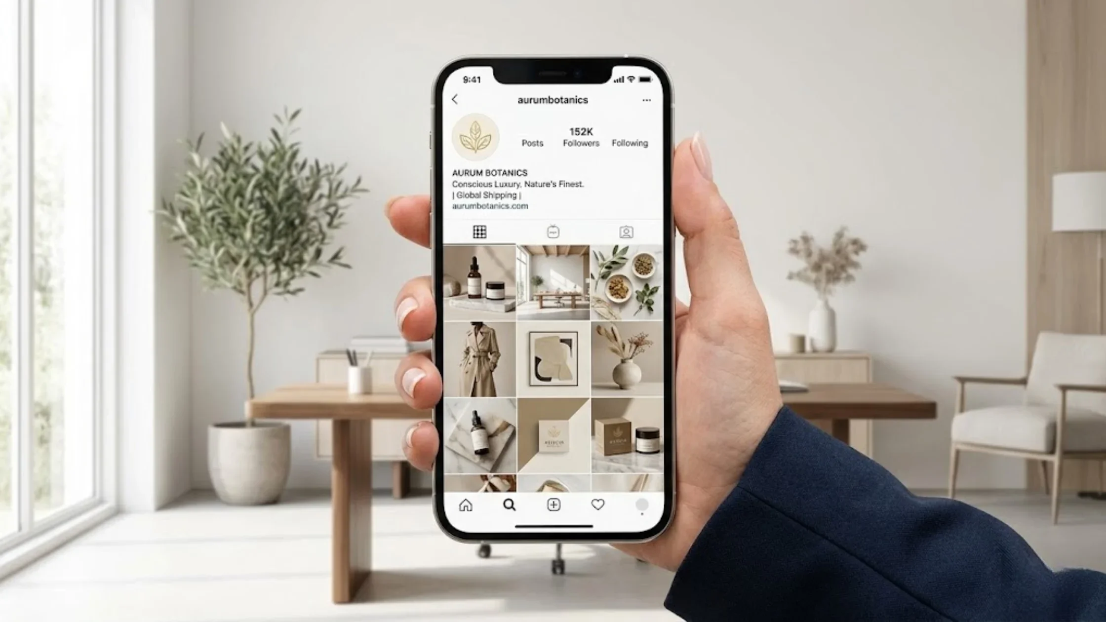
2. The Frankenstein Social Media Feed
Consistency is the bedrock of Brand Perception NZ. If someone looks at your Instagram and then visits your website, do they feel like they are in the same world? If your Facebook posts use bright neon green but your website is navy blue and professional, you are creating brand friction.
Inconsistent social graphics make a business look unorganised. It suggests that you don't pay attention to the small details. If you don't care about how your own brand looks, a client might wonder if you will care about the details of the project they are paying you for. High-value clients pay for peace of mind. They pay for the certainty that they are in expert hands. A messy visual presence screams amateur, and amateurs cannot charge premium rates.
3. You Are Attracting the Wrong Kind of Bargain Hunters
Are you tired of potential clients asking for discounts? The problem might not be your sales pitch; it might be your visuals. Visuals act as a filter. A high-quality Visual Content ROI is measured by the quality of leads you get, not just the quantity.
If your brand assets look cheap, you will naturally attract people looking for a deal. You are effectively signalling to the market that you are a budget option. Meanwhile, your competitors—who might have less experience than you—are using Creative Ads Assets that look expensive. Because they look expensive, they attract clients who expect to pay more. They aren't fighting over ten-dollar discounts; they are paying for the perceived authority.
4. Your Visuals Fail the Phone Test
In today’s market, especially across Australia and New Zealand, most people will find you on their mobile phones. If your graphics are hard to read, your images are blurry, or your layout is clunky, you lose authority instantly.
A professional Brand Asset Audit checks if your visuals are fit for purpose. If you are using old, low-resolution files for your Creative Ads, you look like a relic of the past. Modern, high-end brands look sharp, fast, and polished on every screen size. If your visuals are devaluing your work, it is likely because they feel behind the times.
5. You Feel Embarrassed to Send People to Your Website
This is the most human sign of all. If someone asks for your website and you find yourself saying, Oh, just look at my LinkedIn, the website is a bit old, you have a problem. That hesitation is costing you money.
When you aren't confident in your brand, you don't show up as an authority. You don't pitch for the big contracts. You stay small because your visual skin doesn't fit your professional muscles. A rebrand isn't just about pretty colours; it’s about giving you the confidence to stand tall in your market. You can learn more about the person behind these transformations by visiting About Nish.
Why This Matters for Your Bottom Line
Investing in your visual strategy is not an extra expense; it is a core business move. It is about the Visual Content ROI. When your visuals match your expertise, you stop competing on price and start competing on value. You move away from being a commodity and become a category of one.
At Wild Sea Creative, we help businesses across Nelson and the wider NZ/AU region find their true Brand Voice. We look at the gaps where your current visuals are leaking money and we plug them with high-converting, beautiful assets.
Ready to stop being out-priced by the other guys? Don't let a budget look hold back a premium business. It is time to align your visuals with your true value. Contact Wild Sea Creative today to book your strategy session and turn your brand into your most powerful sales tool. Let's make sure your first impression is your best one.
Frequently Asked Question (FAQs)
-
A brand asset audit is a deep-dive review of every visual and verbal element your business uses to communicate. This includes your logo, colour palette, typography, social media graphics, and website layout. The goal is to see if these items are working together or fighting against each other. For businesses in New Zealand and Australia, it helps identify if your look matches the local market expectations. By checking for consistency and quality, an audit shows you exactly where your brand is losing professional weight and where you might be accidentally looking cheaper than you actually are. It is the first step toward a more profitable visual identity.
-
You need a brand audit because markets change and brand drift is real. Over time, businesses often add new services or social channels without updating their original look. This creates a messy, Frankenstein brand that confuses customers. An audit helps you regain control. It ensures that your visual presence is actually helping you reach your financial goals rather than holding you back. If you find that you are being out-priced by competitors or attracting the wrong type of clients, an audit will reveal the visual gaps. It’s about making sure your business looks as expert and reliable as the services you provide every single day.
-
Visuals act as a psychological anchor for your price. Before a customer reads a single word of your proposal, their brain has already assigned a value to your brand based on how it looks. High-end visuals with clean lines, professional photography, and cohesive designs signal premium quality. This allows you to charge more because the perceived risk for the client is lower. If your visuals look DIY or dated, the perceived risk is higher, and customers will demand a lower price to compensate for that risk. By improving your visual identity, you are essentially pre-selling the value of your work, making it much easier to hold your price points.
-
Yes, a cheap logo can significantly damage your sales potential. A logo is the most basic symbol of your business’s credibility. If it looks like it was made in five minutes using a free online generator, it suggests that you might take shortcuts in your actual work too. In a competitive landscape like NZ and Australia, customers have plenty of options. They will naturally gravitate toward the brand that looks the most established and trustworthy. A low-quality logo can make a twenty-year veteran look like a first-year amateur. Investing in a professional logo is not just about aesthetics; it is about protecting your reputation and your revenue.
-
Ideally, you should perform a brand asset audit every 12 to 18 months. Business moves fast, and visual trends evolve. What looked modern three years ago might look like a relic today. Regular audits allow you to make small, healthy adjustments rather than waiting until your brand is completely broken and requires a massive, expensive overhaul. It’s like a regular health check for your marketing. Frequent audits also help you stay aligned with your audience’s changing tastes, ensuring that your Visual Identity Strategy remains fresh, relevant, and capable of supporting your current business growth and pricing.
-
Common signs include using fonts that were popular ten years ago, blurry or pixelated images on your website, and a colour scheme that feels heavy or dull. Another major sign is inconsistency—where your business cards, website, and social media all look like they belong to different companies. If your website isn't mobile-friendly or takes too long to load due to old graphic formats, that is a huge red flag. Finally, if you feel a sense of cringe when you hand out your marketing materials, your brand has officially outgrown its skin. These signs tell the world your business is stagnant, even if you are innovating behind the scenes.
-
Consistency builds trust by creating a predictable and professional experience for the customer. When a brand looks the same on LinkedIn, their website, and in their email signature, it sends a message of stability and attention to detail. It proves that the business is organised and has a clear identity. In the minds of customers, a consistent brand is a reliable brand. If they can’t trust you to keep your colours and logos consistent, they may subconsciously worry about the consistency of your service. In high-stakes industries, this visual reliability is often the deciding factor that leads a client to choose you over a messy competitor.
-
The ROI (Return on Investment) of professional brand design is found in three main areas: higher conversion rates, better client quality, and the ability to raise prices. While it is an upfront cost, a strong brand works for you 24/7. It reduces the sales friction because clients already believe in your value before you speak to them. It also saves money in the long run because you aren't constantly trying to fix mismatched graphics or re-doing cheap work that didn't last. A professional brand is an asset that appreciates over time, building brand equity that makes your business more valuable if you ever decide to sell it.
-
Start by gathering every single piece of public-facing material you have. Open your website, your social media profiles, your latest invoices, and your email templates. Put them all on one screen or print them out. Ask yourself: Do these all look like they come from the same expert? Look for weak links like old logos or low-quality photos. Check if your messaging matches your visuals. Most importantly, look at your top three competitors. Does your brand look more or less expensive than theirs? If you feel overwhelmed, reaching out to a specialist like Wild Sea Creative can provide an objective, expert eye to identify the leaks in your brand.
-
A logo is just one mark or symbol. A visual identity is the entire system that surrounds it. Think of the logo as the face, while the visual identity is the entire outfit, the way the person speaks, and the vibe they give off. A visual identity includes your colour palette, your choice of photography, the weight of your lines, and your typography. You can have a great logo, but if your visual identity is weak, the brand will still feel off. A complete Visual Identity Strategy ensures that every single touchpoint—from a tiny Instagram icon to a giant billboard—tells the same professional story about your business.