Crafting the Brand Logo for Authenticity Acupuncture
Authenticity Acupuncture is a beautiful new business in Nelson, and I was brought in right at the start to help shape its visual identity so it could launch with confidence and clarity.
-
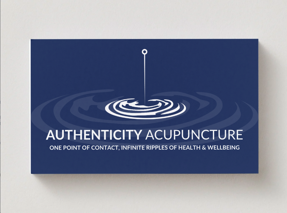
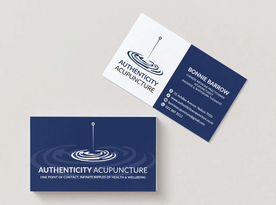
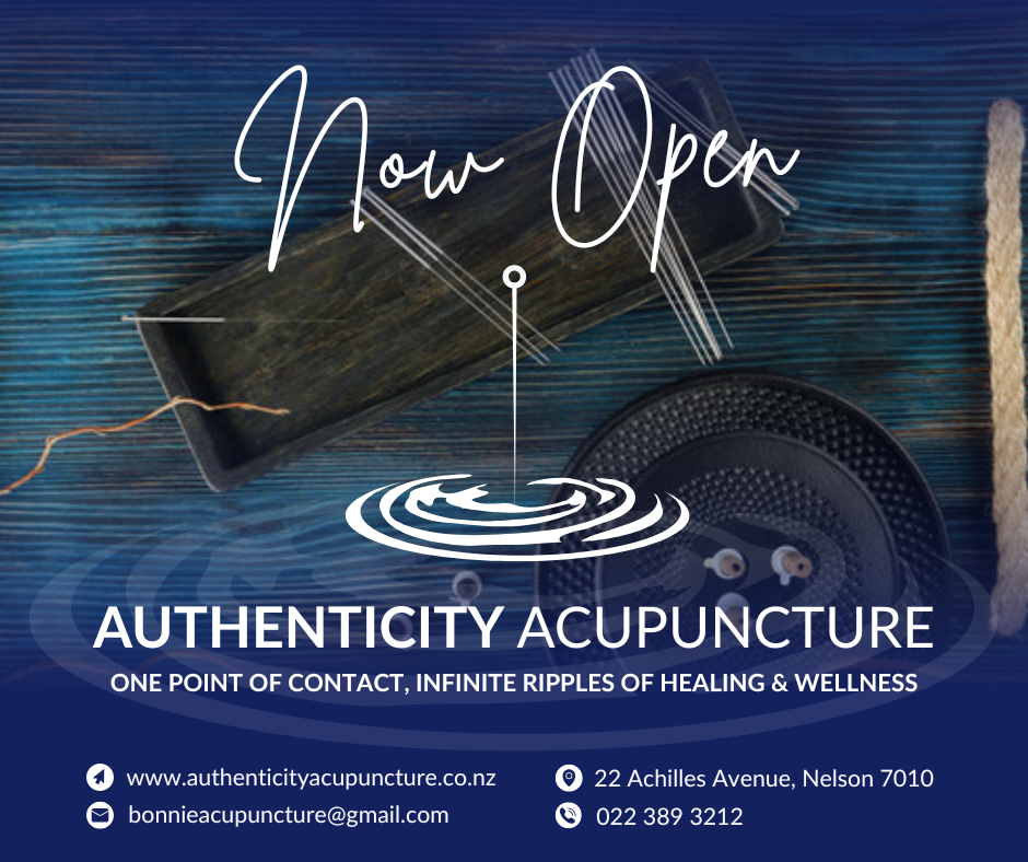
From day one, it was clear the brand needed to express more than just “acupuncture”. The vision was one point of contact with endless ripples of health and wellbeing. I took that concept and wove it directly into the logo – using a fine acupuncture needle as the central point, with soft ripples radiating outward to symbolise the flow-on effects of treatment through body, mind, and life.
-
To support that feeling of calm transformation, we chose a soothing blue as the hero colour. It feels grounded, peaceful, and trustworthy – the sweet spot between holistic and professional. The palette was designed to work beautifully across digital and print, giving Authenticity Acupuncture a cohesive, recognisable look from day one.
-
By listening closely to what the client wanted their practice to represent, we created a logo and colour scheme that truly reflects their ethos. Authenticity Acupuncture now has a clear, meaningful visual identity that’s ready to roll out across signage, website, social media, and printed materials – a strong foundation for a new Nelson health and wellbeing brand.
This project was a great blend of creativity and strategy - as the logo and branding was truly designed to be recognisable yet impactful.